Modified on: 17/09/2026
What a CBD Flower Photo Can Tell You
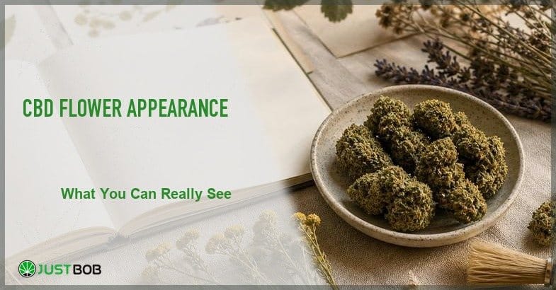
A flower photo can tell you a few useful things at a glance. It can show colour, trim, density, visible trichomes, leaf fragments, texture and how carefully the product has been presented. It cannot tell you everything. That is exactly why CBD flower appearance should be read beside product descriptions, labels and batch documents.
On Justbob, appearance is part of the product story, but not the whole story. A good image helps readers compare CBD flowers visually. A clear description explains what the image reveals, while a lab report keeps the product’s measurable characteristics tied to its specific batch. Together, these three elements provide the most complete picture.
-
 Max CBDAMNESIA CBD BOOSTStarting from: 0,85 €/g
Glasshouse | CBD<40%
Grams5 10 20 50 100 200 400 -
Max CBDAK47 CBD BOOST
Indoor | CBD<47%
Starting from:HALLOWEEN SALE -10%
1,45 €1,30 €/gGrams5 10 20 50 100 200 -
Max CBDCHARAS
CBD HASH | CBD<45%
Starting from:HALLOWEEN SALE -10%
0,90 €0,80 €/gGrams5 10 20 50 100 200 -
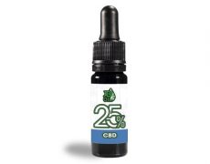
JB OIL 25%Starting from: 14,90 €
CBD Oil 25%
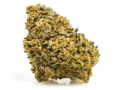
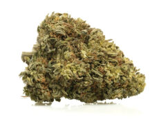
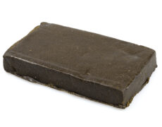
There is a certain pleasure in taking a closer look at a flower. One shade of green is never quite the same as another. Some hemp buds are compact and dense, while others have a looser, more open structure. Some CBD flowers display a frosty coating of trichomes, whereas others have a more matte appearance. These visual details can be informative—but only when interpreted with care.
Pretty pictures are not a substitute for paperwork. They are the friendly front door.
What CBD flower appearance means
CBD flower appearance is the set of visible details that help readers describe the flower, such as its colour, shape, trim, density, texture, leaf content and visible resin. These are descriptive features that help readers compare products without turning an image into a promise about what’s inside.
A CBD flower may appear compact or airy, densely packed or more open, bright green or darker in colour. It may look heavily coated in resin, neatly trimmed or slightly more rustic. These descriptions simply reflect what can be seen. On their own, they do not confirm cannabinoid content, chemical composition or overall quality.
Natural variation is an inherent characteristic of hemp. No two flowers are exactly alike, even when they come from the same variety. Buds can differ in size, shape, colour and texture depending on the plant, growing conditions and post-harvest handling. For this reason, visual descriptions should always leave room for normal botanical variation rather than suggesting absolute uniformity.
Images are useful because they help readers compare products at a glance. A photograph can show whether a flower appears dense or loose, carefully manicured or more natural in presentation. What it cannot do is replace objective information. Laboratory analysis remains the appropriate source for verifying cannabinoid levels, legal compliance and other measurable characteristics.
Read also: CBD Flower Lab Report: How to Read a COA – Justbob
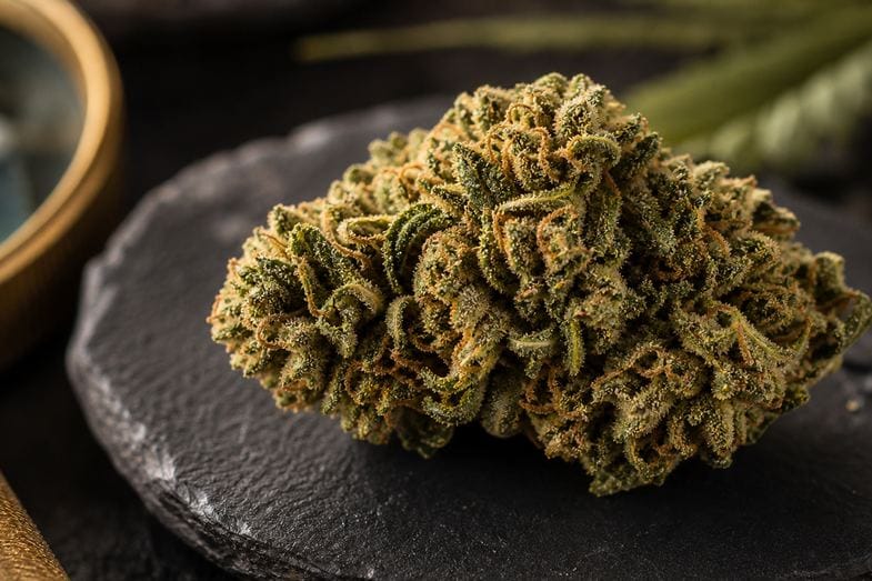
Colour, trim and CBD flower structure
Colour is often the first feature people notice. CBD flowers can range from bright green to olive, with darker shades, lighter highlights and occasional orange or amber pistils. The most useful descriptions are straightforward and accurate. Terms such as bright green, olive green, deep green or subtle golden accents describe what is visible without implying anything about the flower’s quality.
Trim is another important visual characteristic. A neatly trimmed flower has fewer visible leaves surrounding the buds, giving it a cleaner appearance. A more natural or rustic trim leaves more of the plant material intact. Neither style is inherently better than the other—they simply reflect different levels of post-harvest processing. Like colour, trim should be described objectively rather than presented as a measure of quality.
The flower’s structure provides another point of comparison. Hemp buds may appear compact and rounded, elongated, airy or naturally irregular. A dense flower will often look very different in photographs from one with a looser structure, making these observations useful when comparing products side by side. The key is to describe what is actually visible, not to infer characteristics that cannot be confirmed from appearance alone.
A simple rule helps keep product descriptions reliable: describe what the image shows. If the buds appear compact, say they are compact. If they have a more open structure, describe them as airy or open. If the trim looks clean and tidy, say so. Clear, factual language is usually the most useful way to describe CBD flower appearance.
Leaves, trichomes and texture
A hemp flower has several visible features that contribute to its overall appearance. Small sugar leaves may remain around the buds, trichomes can create a frosted or crystalline look, and the resinous surface often adds texture. Depending on the variety and post-harvest handling, the flower itself may appear dense and compact or looser and more open. One of the defining characteristics of a natural product is that no two flowers look exactly alike. Even within the same batch, slight differences in shape, colour, leaf content and surface texture are entirely normal. Hemp is an agricultural crop rather than a manufactured product, so careful product descriptions should reflect this natural variation instead of suggesting perfect uniformity.
For that reason, the most useful question is simply, What does the flower look like? A photograph can show whether the buds appear compact or airy, whether the trim is neat or more rustic, and whether the surface has a visible coating of trichomes. What it cannot do is confirm characteristics that require laboratory testing or other forms of analysis.
- Trichomes are among the most recognisable visual features of CBD flowers. They appear as tiny, resin-producing structures that often give the surface a frosted or sparkling appearance under good lighting. Describing this visible effect is perfectly appropriate, but it should remain just that—a description of appearance rather than evidence of potency, cannabinoid content or overall quality.
- Leaves also contribute to the flower’s presentation. A carefully trimmed bud will generally show fewer leaf fragments, creating a cleaner look in photographs, while a more natural trim leaves more of the surrounding plant material intact. Neither approach is inherently better; they simply represent different finishing styles and degrees of processing.
- Texture is perhaps the most tactile aspect of a flower’s appearance, even when viewed only in an image. A bud may look dense, airy, resinous, firm, slightly dry or well formed. These observations help readers visualise the product without making assumptions about characteristics that cannot be determined from appearance alone.
Hemp buds and CBD buds: how to tell the difference in wording
The terms hemp buds, CBD buds and CBD flowers are often used interchangeably, but they serve slightly different purposes. Hemp buds refers to the botanical material itself, while CBD buds is common in commercial and consumer-facing language. In editorial content and product descriptions, CBD flower is generally the clearest and most consistent term. This does not mean the appearance changes because the phrase changes. It means the page needs clear vocabulary. When a reader sees hemp flower, CBD flower, hemp buds or CBD buds in the same article, the terms should support the same visual topic instead of creating a maze.
The easiest way to tell the difference is to ask what the sentence is doing:
- If it talks about the hemp plant and visible plant parts, hemp buds may fit.
- If it talks about a product category or catalogue comparison, CBD flower is usually clearer.
For a hemp flower page, the same rule applies to aroma and visual details. The hemp flower description can mention terpenes when it explains scent, and it can mention trichomes when it explains surface texture. The words should serve the reader, not decorate the paragraph.
The goal is to help readers understand what they can observe, not to overload the text with technical terminology. Maintaining consistent terminology also helps distinguish the role of different pages within a website. An article focused on appearance should remain centred on visual characteristics, while broader information about products, cultivation or composition can be explored elsewhere.
Appearance is not a lab report
CBD flower appearance can suggest whether a product photo is clear, whether the trim looks neat and whether the buds are visually consistent. It cannot show THC values, cannabinoid content, terpene data or batch controls. Those details belong in documents.
Checking the certificates supplied with CBD flower can add useful context to what is visible, allowing readers to compare the product’s appearance with its documented batch information.
That is where cannabinoids and terpenes should stay in their proper place. Cannabinoids and terpenes may be discussed on CBD products, but appearance cannot measure them. A flower photo cannot show a tested cannabinoid value. It cannot show a tested terpene profile. It cannot show whether a tested sample belongs to a specific lot. Those points belong in the analysis documents.
This is where Justbob’s product-page structure matters. Justbob carries out constant analyses on all commercialised products and on every lot. The analysis documents are available inside each commercialised product page, so readers can check the documentation connected to the product they are viewing.
The photo and the lab document should not be enemies. They are simply different tools. The photo tells you what the flower looks like. The product description explains the format, aroma and positioning. The analysis document gives measured information for the tested lot.
If a hemp flower product page also mentions terpenes, keep them in the aroma section. If it mentions cannabinoids, keep them in the analysis or product-information section. That separation is boring in the best possible way. It stops one paragraph from trying to do five jobs. If a page tries to make appearance do everything, it becomes less trustworthy. If it lets each element do its own job, it becomes easier to read.
Matching photos with product descriptions
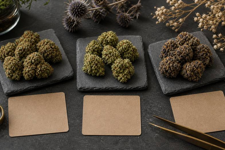
When viewing a CBD flower product page, start with the images. Notice the flower’s visible characteristics: does it appear compact or airy, densely structured or more open, neatly trimmed or more natural? Observe the colour, the amount of visible resin and the overall presentation before moving on to the written description.
Next, compare those observations with the product description. The text should reflect what is actually shown in the photographs. If a flower is described as compact, resinous or carefully trimmed, those characteristics should be consistent with the images. The purpose of the description is to help readers interpret what they see—not to make claims that go beyond the visible appearance.
Aroma descriptions are often presented alongside visual information, and while the two are related, they should not be confused. A flower with a resinous appearance may also be described as having resinous or earthy aromatic notes, while one with a brighter green appearance might be associated with fresher or more herbaceous descriptors. These are complementary sensory descriptions rather than evidence of any specific characteristic.
Finally, review the available laboratory documentation. On Justbob, each commercialised product is accompanied by batch-specific analysis, allowing readers to compare the product’s visual presentation with independently verified analytical data. Together, photographs, product descriptions and laboratory reports provide a more complete and transparent overview than any single element could offer on its own.
Following this sequence—images first, descriptions second and documentation last—offers a practical way to evaluate a product while avoiding assumptions based solely on appearance.
Read also: Discover the role of terpene profile in cannabis | Justbob
A simple CBD flower appearance checklist
A quick visual check can help readers describe what they see without drawing conclusions that the image alone cannot support.
- Colour: Does the flower appear green, olive, darker, lighter or a mix of different shades?
- Trim: Are there visible leaf fragments, or does the flower look neatly trimmed?
- Structure: Are the buds compact, open, rounded or naturally irregular?
- Texture: Does the surface appear resinous, dry, airy, dense or well formed?
- Consistency: Do the flowers look reasonably similar to each other in the product image?
After observing these details, it is important to consider what a photograph cannot reveal. An image cannot show measured cannabinoid levels, laboratory results or confirm product quality on its own. It cannot replace the information provided on the product page or in official documentation. This is not a limitation of photography—it is simply a reminder that a complete evaluation requires more than a visual impression.
For readers exploring CBD flowers, this checklist keeps the process practical and balanced: look first, read second, verify documentation third. No assumptions, no shortcuts, no exaggerated claims. For readers interested in the scientific background of cannabinoids and terpenes, research reviews available through PubMed Central discuss the compounds found in Cannabis sativa and the role of aroma-related terpenes. For readers interested in the scientific background of cannabinoids and terpenes, research reviews available through PubMed Central review on cannabinoids and terpenes, research reviews available through PubMed Central discuss the compounds found in Cannabis sativa and the role of aroma-related terpenes.
Final notes on CBD flower visual checks
CBD flower appearance is valuable when it is described accurately. It helps readers compare visible characteristics such as colour, trim, structure, trichome coverage and texture. It makes a product page easier to understand and provides a useful first impression.
Because hemp is a natural agricultural product, variation between flowers is expected. Descriptions should reflect this reality rather than suggesting that every bud must look identical. Careful visual language is important when discussing flowers, leaves, buds and surface characteristics.
However, an image remains only one part of the overall product information. A reliable CBD flower page should also include a clear description, balanced aroma terminology and accessible laboratory documentation. This is why Justbob provides batch analysis: the visual aspect and the documented information should complement each other.
🌿 Want to learn more about the CBD cannabis products available in our catalogue? Visit the Justbob online store and discover our legal CBD products among CBD oils, hash, and extracts!
Frequently asked questions about CBD flower appearance
What should CBD flower appearance show?
CBD flower appearance should show visible details such as colour, trim, structure, texture, trichomes and leaf presence, so readers can compare product photos more clearly.
Can appearance prove CBD flower quality?
No. Appearance can support product reading, but it cannot prove product quality or measured values by itself. Product descriptions and analysis documents are needed too.
Why compare photos with batch reports?
Photos show visible details, while batch reports show measured product information. Reading both gives a clearer and more balanced view of the product page.